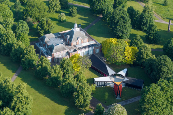
Serpentine Pavilions
Serpentine Gallery
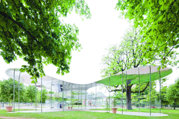
2009
SANAA
This deceptively complex cloud-like structure required an innovative approach to engineering and finishing. Working closely with consulting engineers Arup, we ensured the geometry and overall aesthetic of the design wa achieved, drawing on our in-depth understanding of different materials, fixings and finishing techniques.
2010
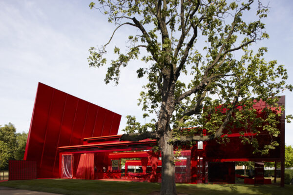
Jean Nouvel
Bold and strikingly geometric, this vivid red pavilion consisted of a versatile system of interior and exterior spaces experimenting with the idea of play. As lead building contractor, we were responsible for the manufacture and installation of all 45 tonnes of the steelwork – including the dramatic free-standing 12m high gravity-defying wall – along with flooring, bar and chess area. During the build process, we identified practical design solutions along with providing the distinctive paint finish.
2011
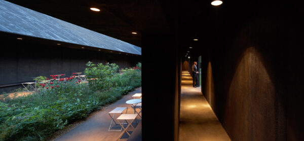
Peter Zumthor
With this outwardly austere timber pavilion, Zumthor took the concept of a mediaeval ‘hortus conclusus’, creating a quiet and meditative space, detached from city bustle and noise that provided the perfect minimalist backdrop for the Piet Oulfson designed garden within. Constructed from timber and given a painterly, minimalist finish, a series of staggered doorways led visitors along multiple pathways to the stillness of the interior garden within. The pavilion also functioned as a backdrop for the constantly changing light from the atrium where the roof of the pavilion formed a frame for the sky above.
2012
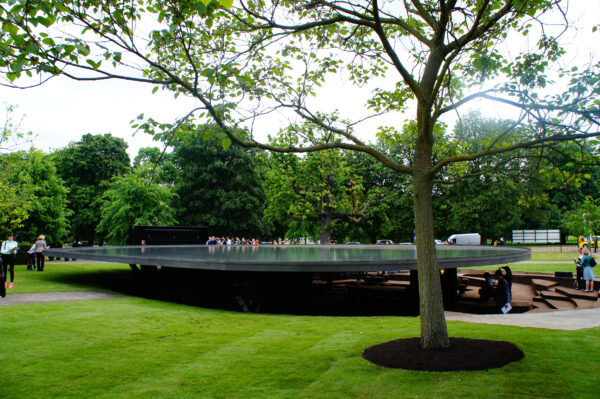
Herzog & de Meuron & Ai Weiwei
The structure was lined with cork, an unusual building material but one that is sustainable and of a colour and texture reminiscent of the excavated earth. A floating platform roof, 1.4m off the ground, held a shallow reflective pool of rain water, while the archaeological approach of the design was reflected in the twelve supporting columns, each one representing a past pavilion, with a thirteenth representing the 2012 structure.
2013
Sou Fujimoto
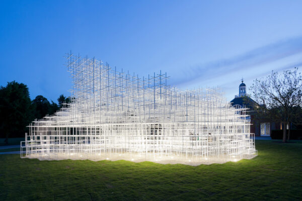
Constructed from a modular mesh of 400mm and 800mm steel frames, Sou Fujimoto’s pavilion had the appearance of a seemingly weightless cloud, varying in density according to viewpoint and with an open structure that allowed visitors to climb inside on varying levels of acrylic steps and platforms. The pavilion won the Best Temporary Building in London at the New London Awards, an award which recognises the very best in architecture, planning and development in the capital. This award is judged by an international jury who look for schemes of the highest design quality that demonstrate a positive impact on their surroundings.
2014
Smiljan Radic
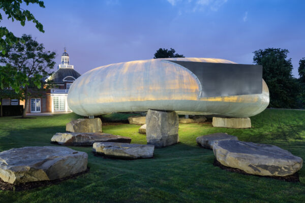
Described as “A futuristic design that looks like it has come from the Stone Age”, the torus structure of this pavilion consisted of a delicate GRP shell resting lightly on 61 tonnes of roughly hewn stone. We worked closely with Smiljan Radic, producing prototype panels and devising the complex steel frame necessary to realise his extraordinary and beautiful design. From the outside, the pavilion shell looked opaque but once inside, the papier-mâché inspired panels appeared semi-transparent, allowing the visitor to feel in touch with the landscape of the park beyond.
2015
SelgasCano
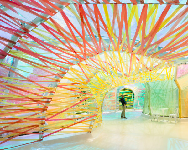
This polygonal structure comprised a modular skeleton of white steel arches, laced with panels and ribbons of EFTE. The pavilion was playful, organic and colourful; the double-skinned construction offering multiple entrances and exits including a secret corridor between the inner and outer layers. ETFE has a high corrosion resistance, strength over a wide temperature range and also stretches over three times its own length without loss of elasticity, making it an interesting material and one that fully exploited the experimental opportunities offered by the Serpentine commission.
2016
Bjarke Ingles Group
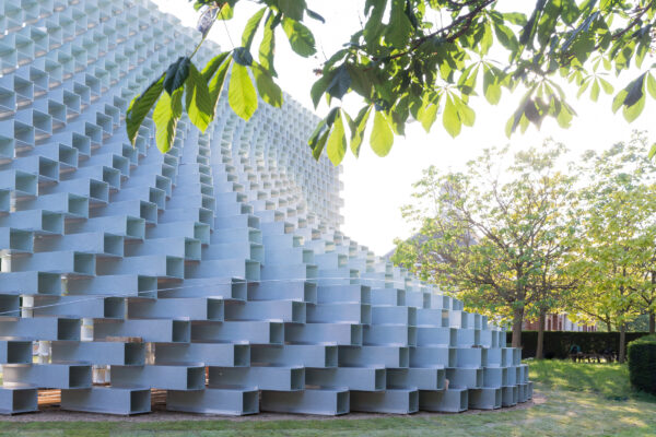
This deceptively complex pavilion was built using 1800+ semi-translucent pultrusion GRP boxes, precisely orientated and stacked to within a 1mm tolerance of the footprint. The boxes varied in thickness and dimension in accordance to their precise load-bearing location in the wall, while lengths of specially made aluminium extrusion cruciform and bespoke pig-nosed bolts linked them together. We even manufactured a bespoke tool to facilitate working within the restricted internal dimensions of each box. enabling the creation of surprising curves and a cathedral-like interior.
2017
Kéré Architecture
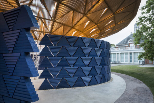
Inspired by the large canopy of a tree, Diébédo Francis Kéré’s pavilion rested on fourteen legs arranged around a central oculus. An intricate oval canopy of cantilevered steel rose and spread outwards, the 420 bespoke triangular roof panels casting shade below. Laser cut holes enabled precise alignment of the wooden slats, achieving continuous lines radiating from the centre through to the canopy’s outer edge. Striking blue modular walls provided shelter with glimpses of sky and the park beyond, each module chamfered to create added interest in the changing light.
2018
Frida Escobedo
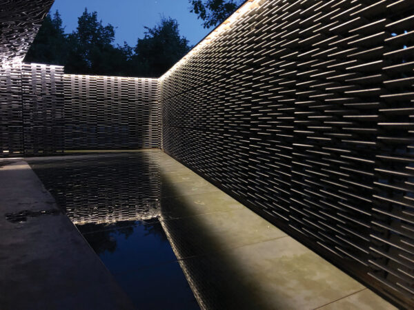
A cool courtyard screened by latticed walls, Frida Escobedo’s pavilion used simple materials and sharp geometry. Steel base plates and 8,000 concrete roofing tiles were used to create the precisely stacked walls, allowing light and breeze to percolate as in a traditional Mexican celosia. The steel roof was manufactured in sections and topped with a smooth, black membrane. Inside, mirror-polished stainless steel formed a drooping but sharp-edged reflective ceiling. Recessed 5mm into the concrete floor, a long triangular pool added to the deliberate geometry while providing playful reflections.
2019
Junya Ishigami
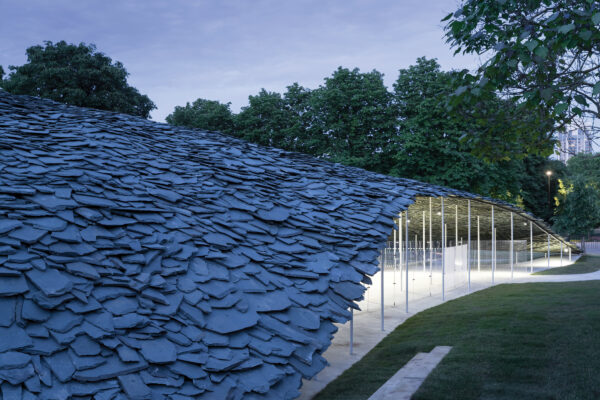
The flowing slate roof of Ishigami’s pavilion emerges from the grassy parkland surrounding the Gallery, its weighty yet slender form arching over a series of 106 narrow steel columns. The design is simultaneously heavy and light: creating this illusion in the tight timeframe drew heavily on our CAD and engineering experience along with our digital manufacturing capabilities. The structure comprises 61 tonnes of slate and ten tonnes of steel, with the resulting wing-like canopy providing shelter for contemplation during the day and cultural events in the evenings.
2021
Sumayya Vally and Counterspace
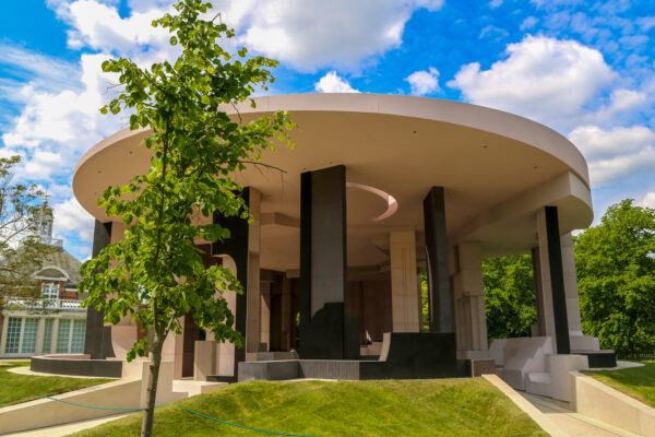
The pavilion design was inspired by the buildings and neighbourhoods of London. The scheme used reclaimed steel to reduce the environmental impact of the pavilion. It was one of the more substantial pavilions we’ve made too, with much of the finishing relying on micro-cement.
2022
Theaster Gates
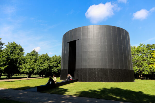
Our 13th Serpentine Pavilion, Black Chapel, was the concept of Chicago-based artist Theaster Gates, who drew inspiration from the architectural typologies of chapels and the great kilns of Stoke-on-Trent. It was the most voluminous Serpentine Pavilion we had constructed, yet it had a sleek elegance in its simplicity.
2023
Lina Ghotmeh
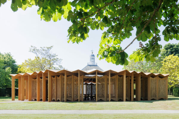
À table refers to the French call to sit together at a table and engage whilst sharing a meal. Its aesthetic however is an embodiment of nature inspired by the surrounding tree canopy. A perimeter structure of glulam beams represents the trees, the pleated plywood roof reflecting the form of a leaf, and plywood fretwork wall panels cut on our CNC machines depict an organic display. An enchanting design of wooden fabrication and modular build, the Pavilion was shortlisted in the 2023 Wood Awards as an outstanding timber installation.
2024
Minsuk Cho, Mass Studies
For fifteen years we have delivered the Serpentine Pavilion from render into reality. The 2024 design from Minsuk Cho and his firm Mass Studies, is a multi-faceted timber construction titled the ‘Archipelagic Void’. A series of five islands, each with its own form and intention, culminates in a congregational void in the centre representational of a Korean madang (courtyard). Built as individual structures, marking out was a critical phase in the process to ensure the structures would come together with absolute precision. To build a pavilion in a little over seven weeks takes resilience, determination and skill, qualities our team bring in abundance.
